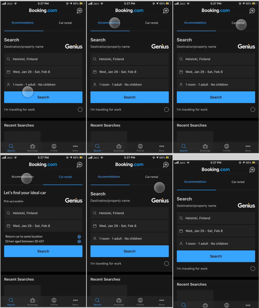
Micro-interaction Redesign: Booking.com
December 2019 – January 2020
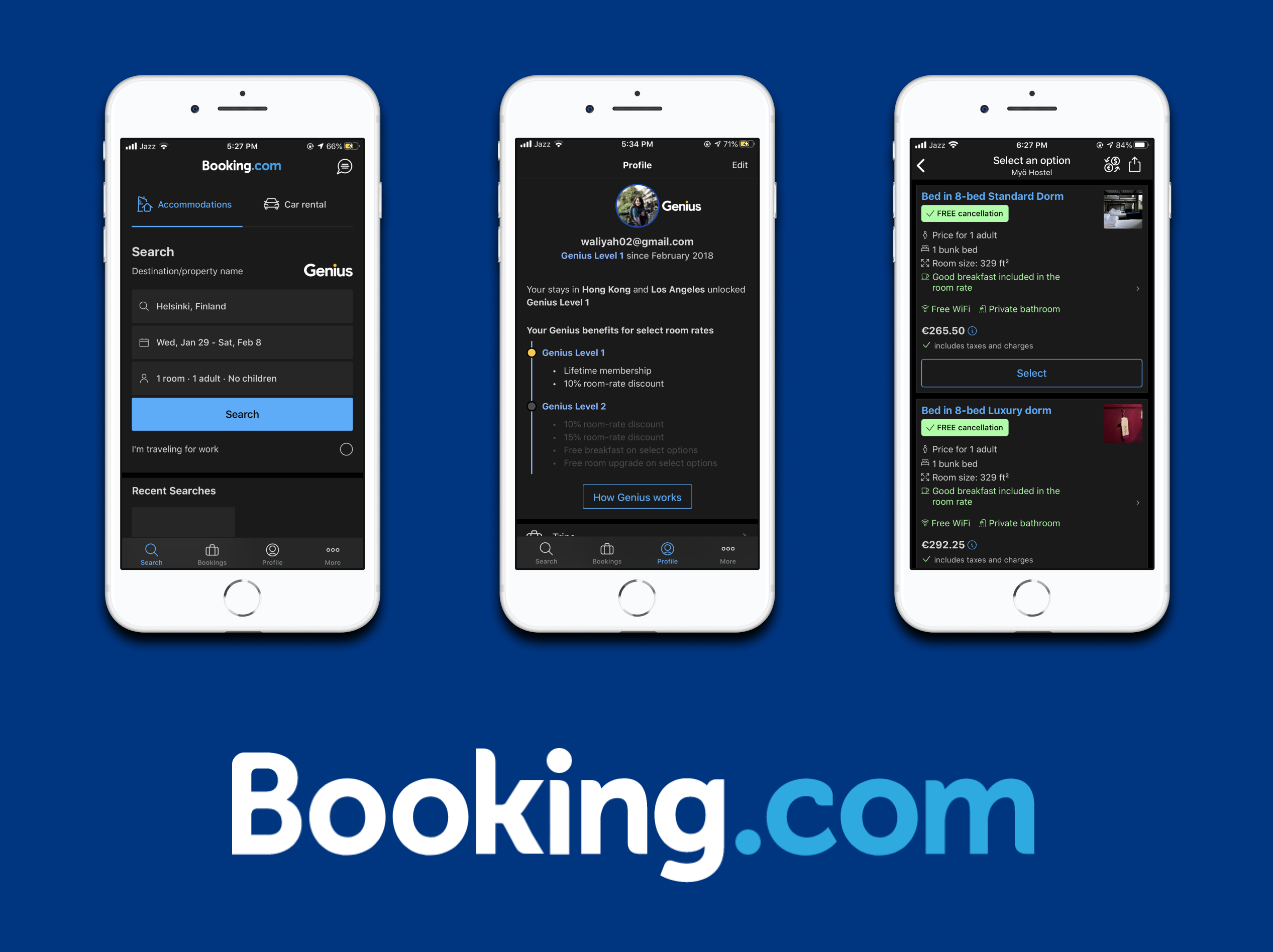
While taking the course on Prototyping Intearctive Systems by Prof. Massimo Zancanaro at the University of Trento, we were asked to do a project using an existing application.
The goal of the project was to redesign micro-interactions in an existing application to improve the UX.
My Role(s):
– Individual project
Tools & Methods Used:
– Axure
Critique of overall macro-design decisions:
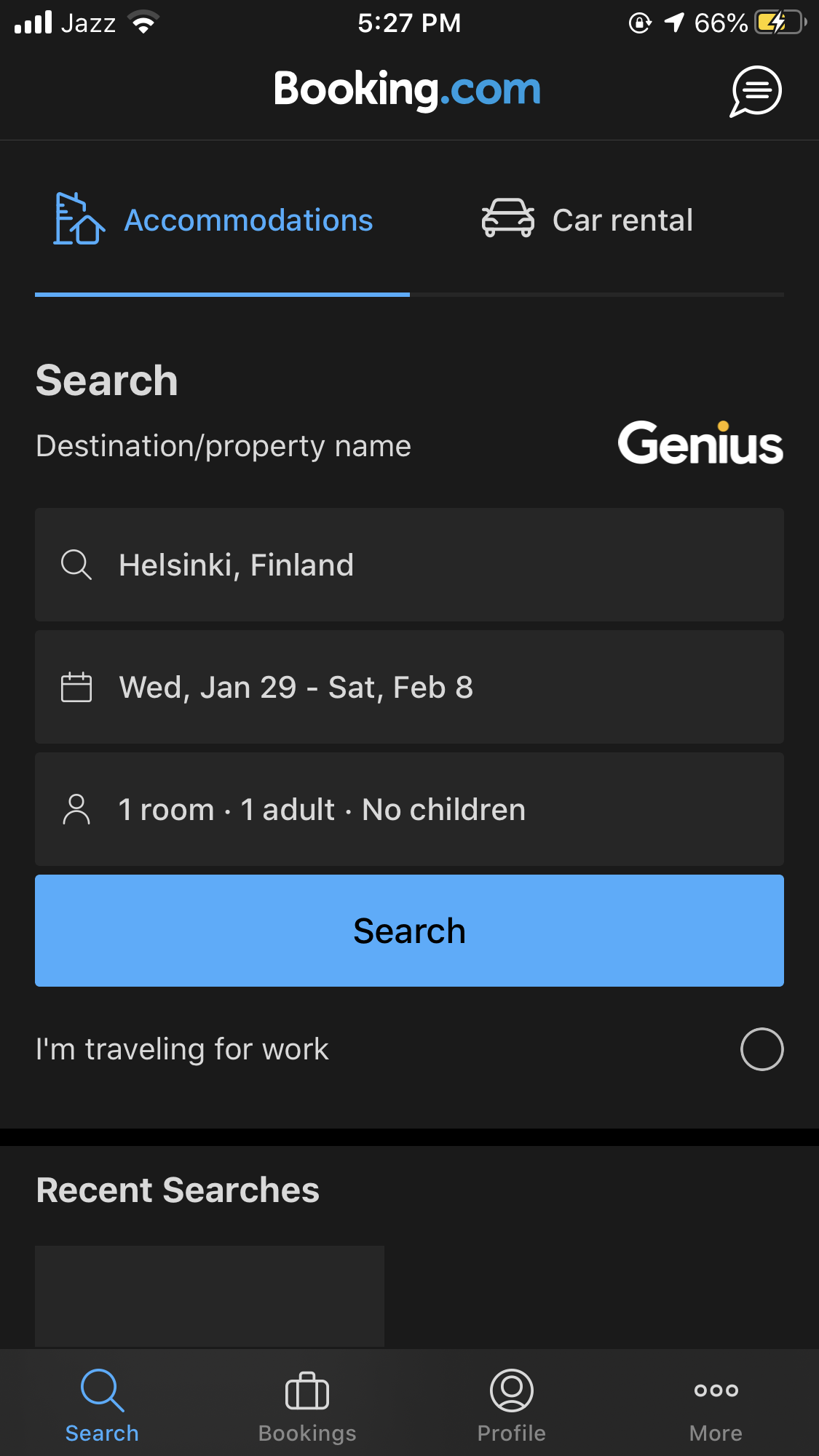
– The app is built around the “search” functionality as users are looking for places to stay (persistent search)
– The search is mainly catered for accommodation
– There is a car rental option as well, but it is not designed in the same UI as the app.
– There are a lot of other actions and features that are all “additional” and put in one big “More” page.
– Main navigation is done through the bottom navigation bar
– The top bar contains certain isolated actions/pages (Notifications, Booking Assistant) [each page has a unique top bar]
– Navigation is mostly direct, but difficult to distinguish between navigation and action sometimes as both are used interchangeably.
Main Problems:
Navigational:
- No consistent navigation
- Unnecessary navigation (one step too many)
Action-based:
- Actions designed as navigational items (with back buttons)
- Lack of signifiers, feedback and feedforwards when filling forms or accessing user data
Information-based:
- Extra features are not organized to match any coherent mental model
Micro-interaction Redesigns
1. Selecting Rooms
Macro-design decision: To give users individual views of rooms at hotels. (to see facilities, amenities, prices etc)
Micro-interaction: A button to “Select Rooms” visible throughout the page
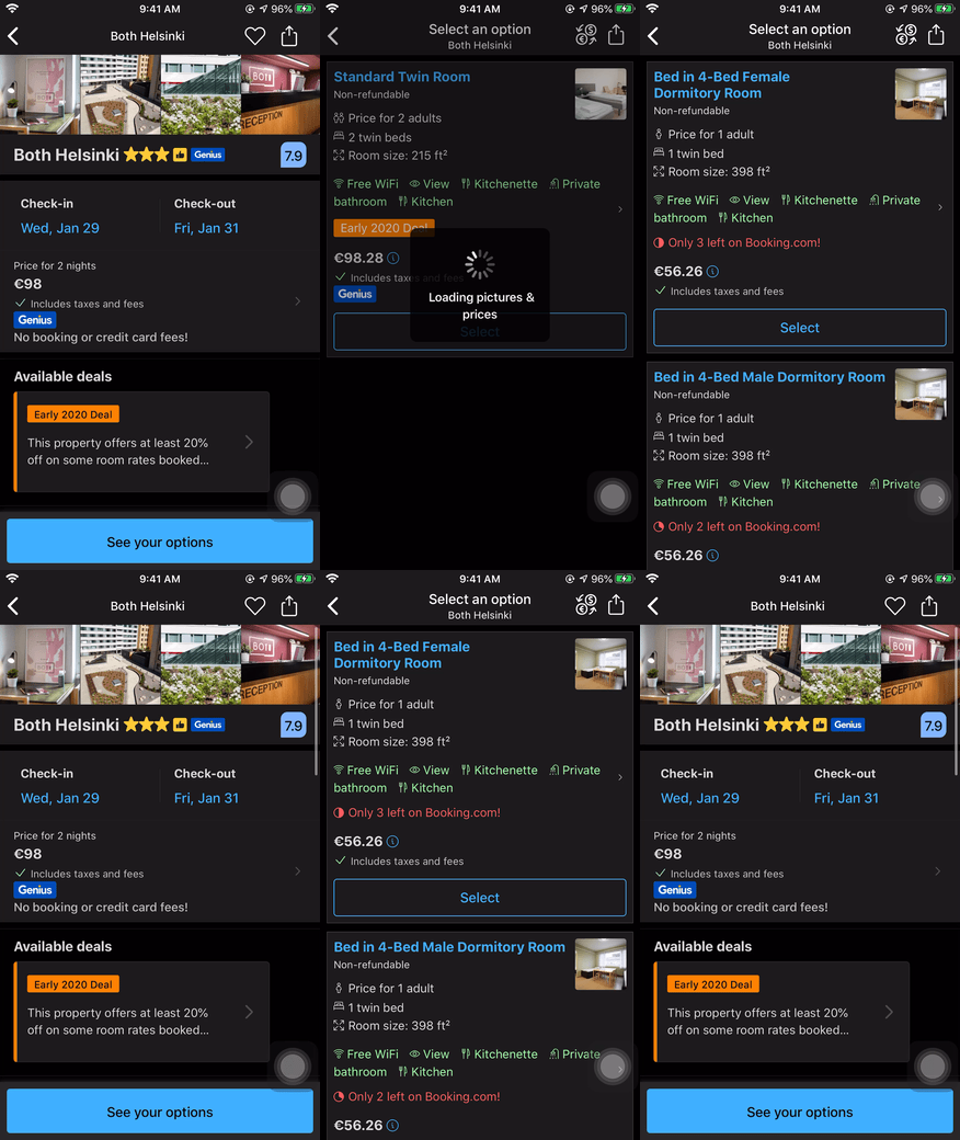
Issues: Both the price in the top and the “See your options” button lead to the same pages – no coherent navigation and all space is filled.
Orginal design
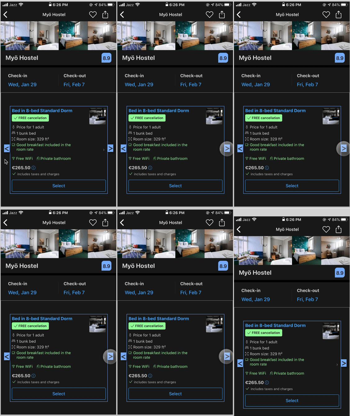
Redesign to scroll through rooms
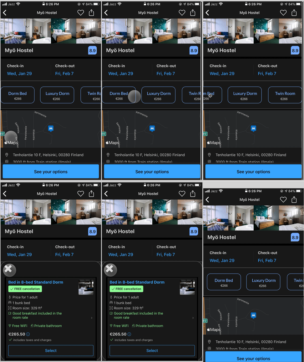
Redesign to show details in pop-up
Proposed micro-design changes:
– Remove the extra pricing button – and add those details into the “See your options” button and make it swipe so a new page does not need to be opened
– Add a scrollable “Room” menu that opens a tab that can be closed within the same page – no need to navigate to another page.
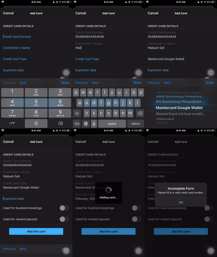
2. Adding a Credit Card
The user has to fill in a form with credit card details to add it to their account for payments.
Micro-interaction: Typing in details into the form. User taps and starts entering in details.
Rules: User must enter a valid credit card.
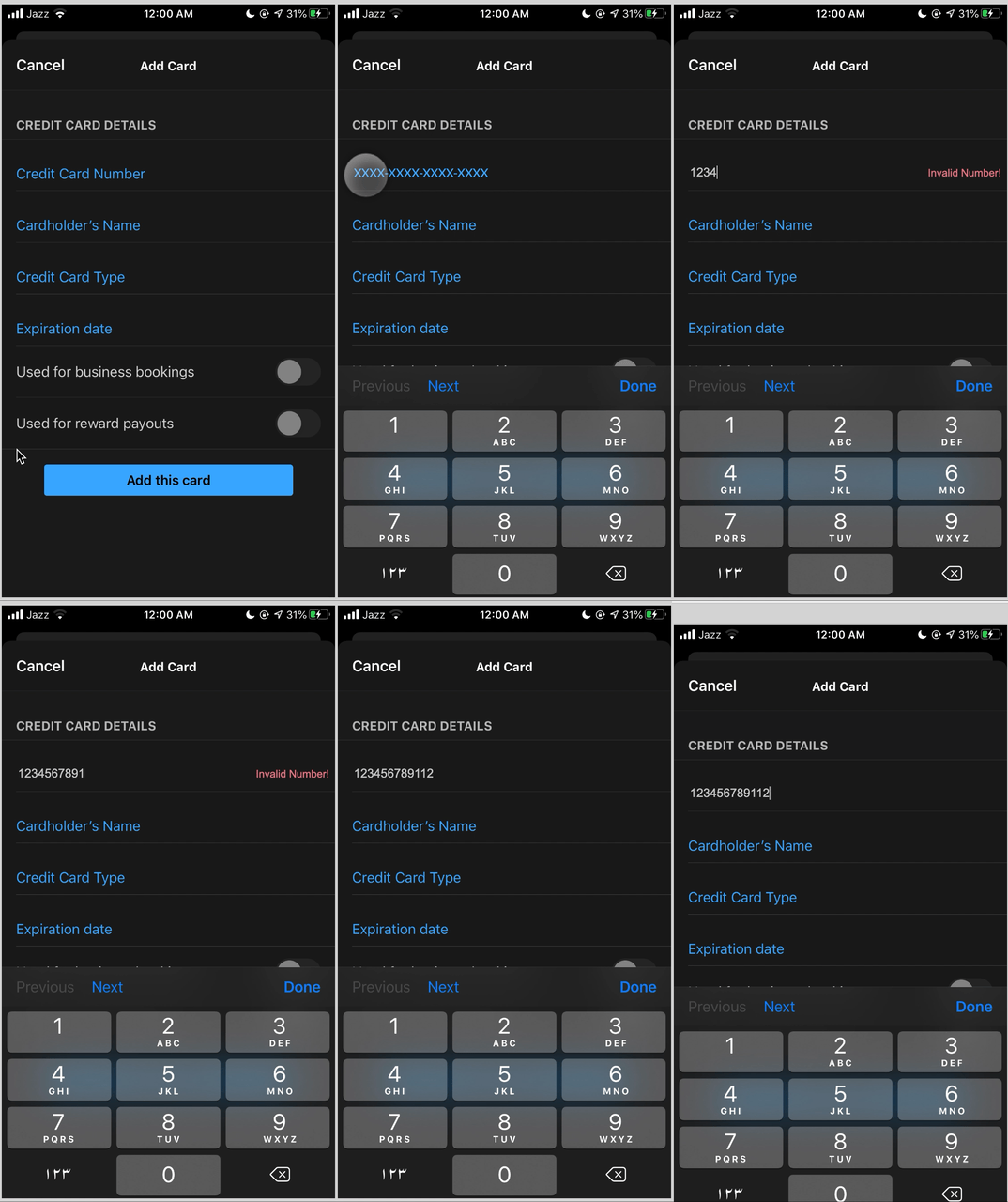
Error states possible: No error checking done as the user is typing, so the user only finds out about the error once they press the “Add Card” button
Orginal design
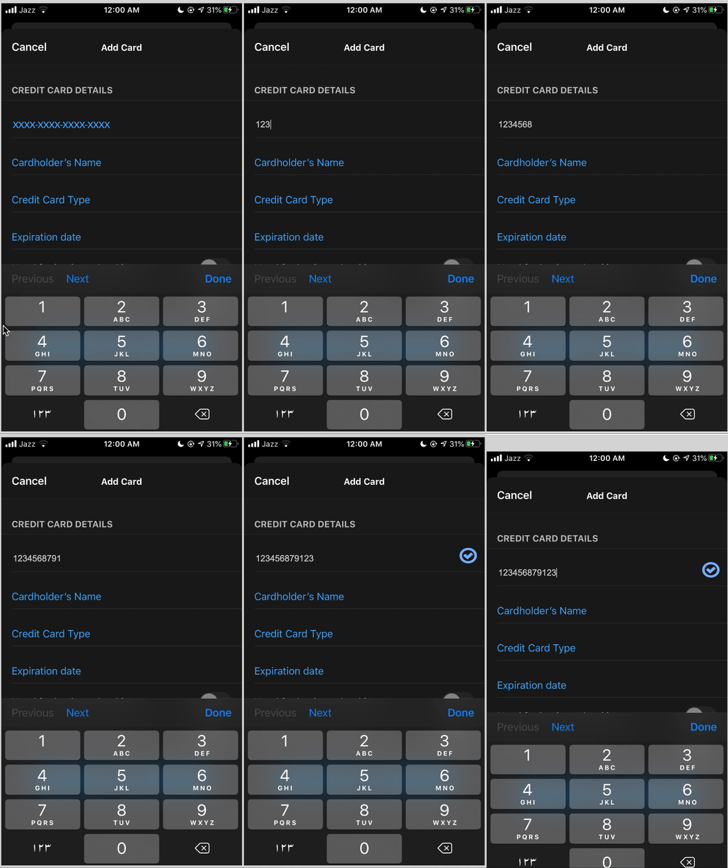
Proposed micro-design changes:
– Add in format of user input into the text fields to avoid error earlier
– Add in an error checking indicator that will ensure the number if valid.
– Add in a feedback when the output is done and checked to be valid.
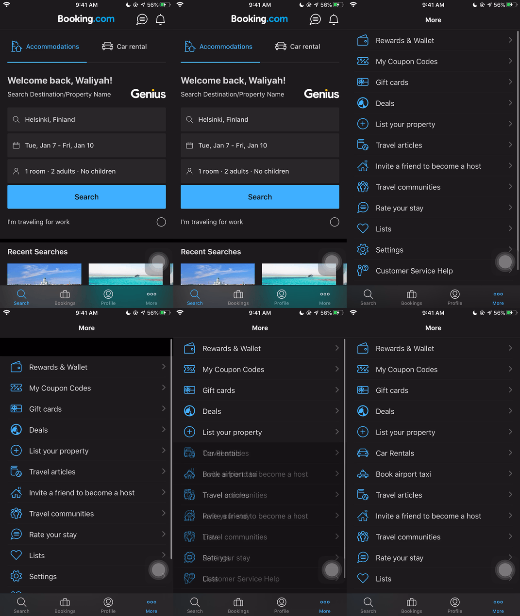
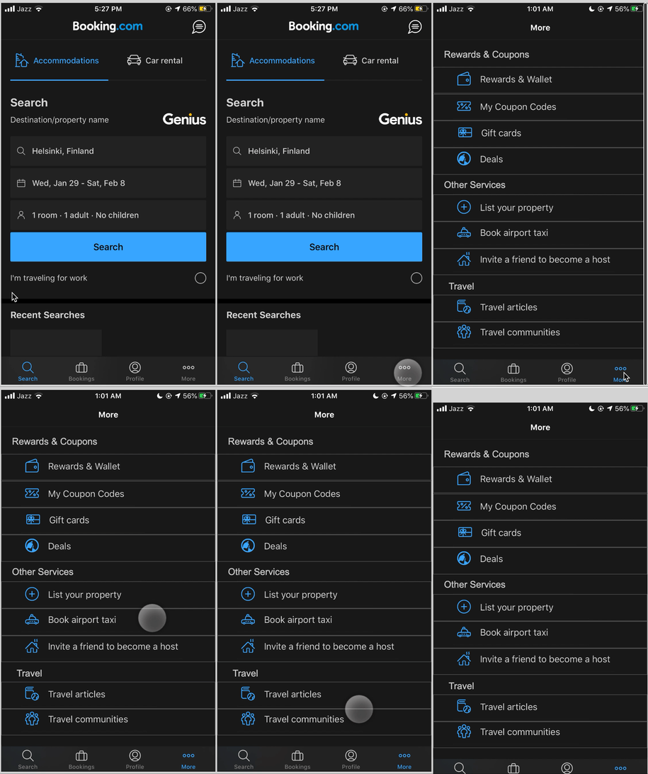
3. “More” Information Organisation
Macro-design decision: To put all other less frequently used features and actions into one page as a list
Micro-interaction: Clicking each individual item from list that is not organised in any form
Rules: User must know what they are trying to find here
Issues: Difficult to make sense of the ordering of this list as some items are also accessible in other places ( Lists, Car Rental, Reviews)
Orginal design
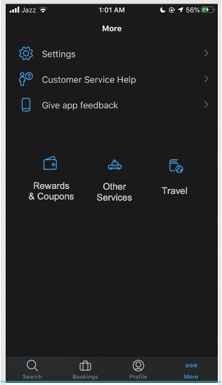
Redesigned with LATCH – categorisation by grouping similar items
Redesigned with LATCH – heirarchy and abstraction
Proposed micro-design changes:
– Organise the information using LATCH principles
– Categorise list so it’s easier to find items
– Categorise and abstract by importance and hierarchy
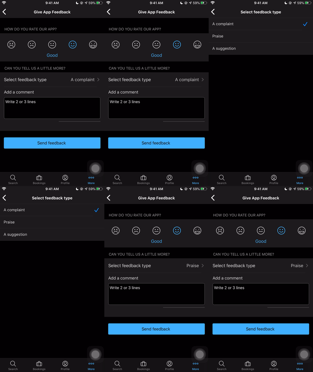
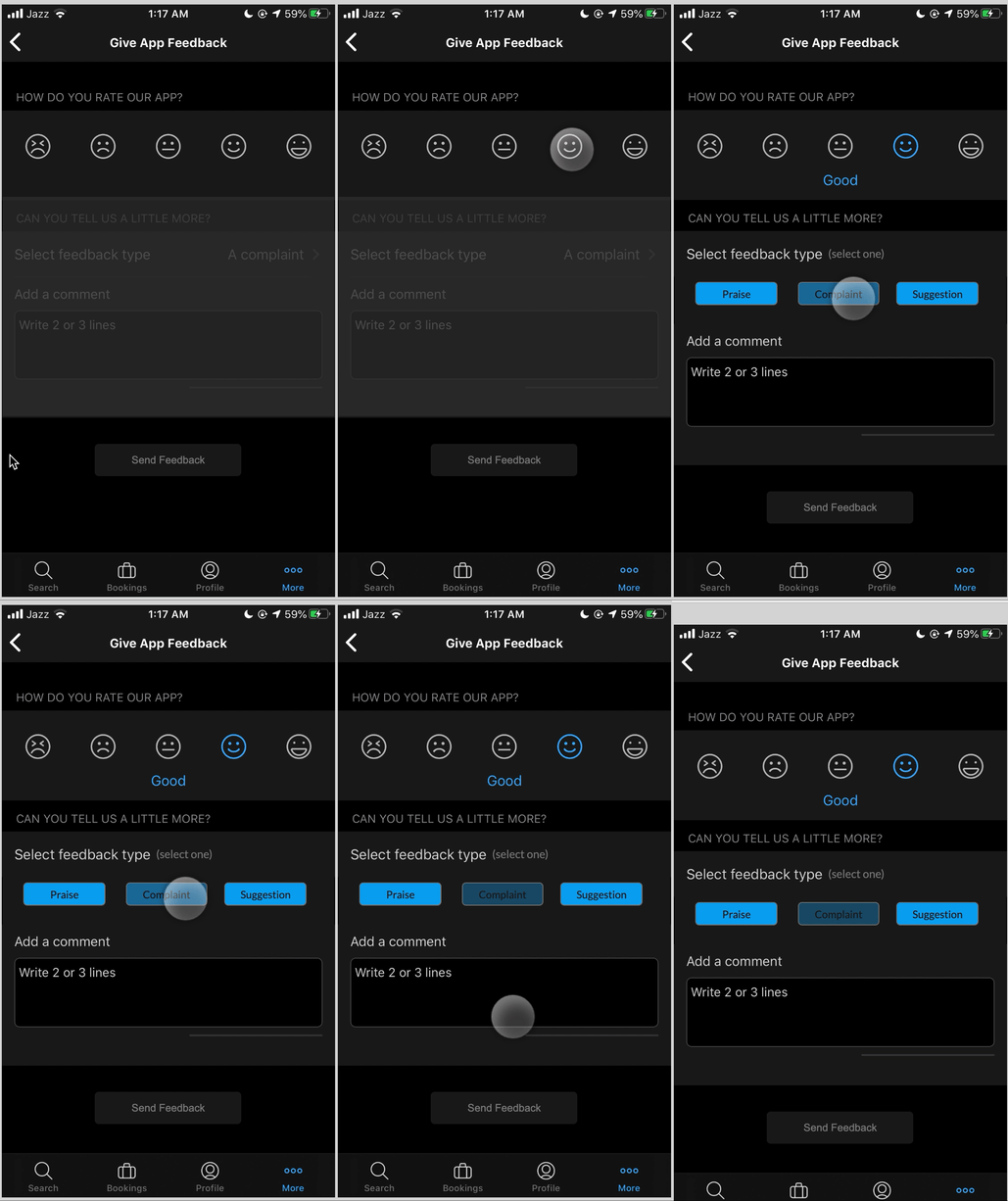
4. App Feedback Details
Macro-design decision: Ask users to give feedback on the app
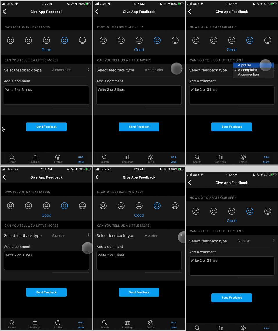
Micro-interaction: Navigate to another page to select a different option by tapping on the field
Issues: Navigational excise when there does not need to be to select a choice.
Orginal design
Redesigned with pop-up selector in-page
Redesigned with buttons to select options directly
Proposed micro-design changes:
– Create a popup selector to select between the three choices instead of a navigational excise.
– Create a button selection in the same page
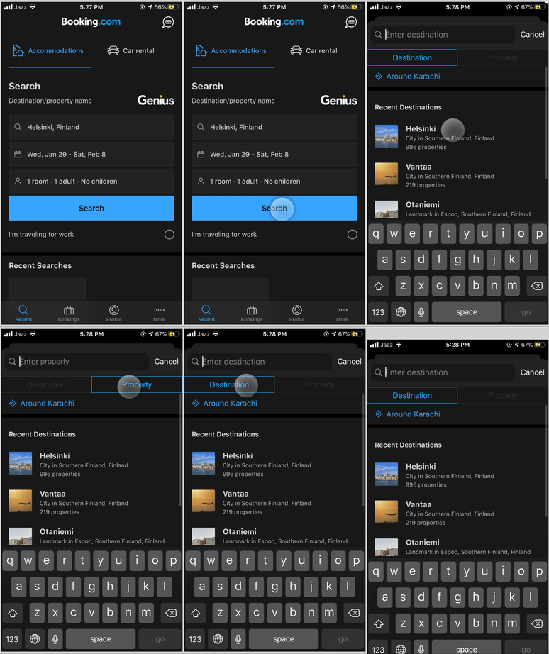
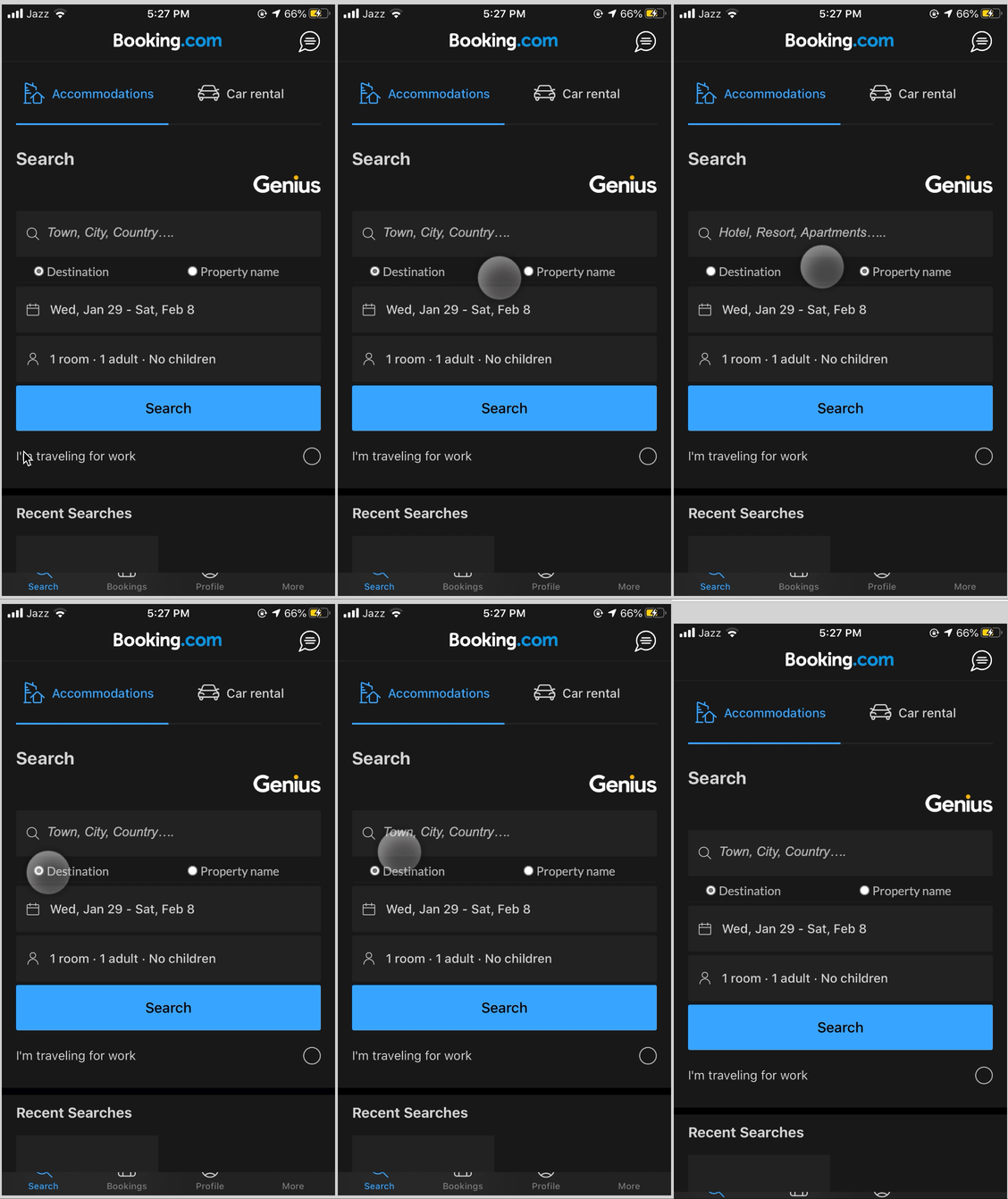
5. Search
Macro-decision: Lets users search by destination or property name that they want to be in. Once focused, the search bar only shows “Destination” as a hint
Trigger: Users input where they want to go by tapping the field.
Rule: They already have a place in mind that they are searching for, and all the information must be filled (either by user or default to find results)
Orginal design
Redesigned with differentiating tabs
Redesigned with radio button selection
Proposed changes:
– Add in two tabs to help users decide whether they want to search by destination or a specific hotel/property name
– Add in radio buttons that are defaulted for destination, but also have a property search available specially for users who want to stay in specific hotels.
6. All Bookings
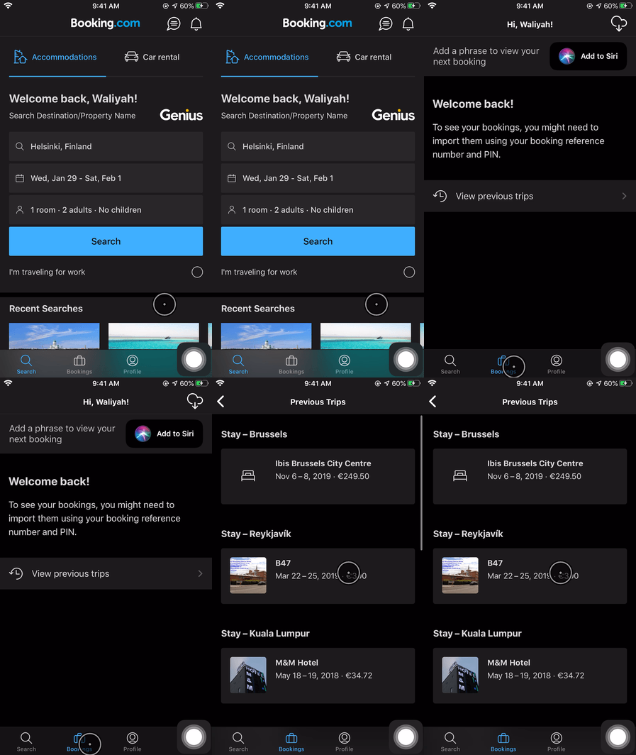
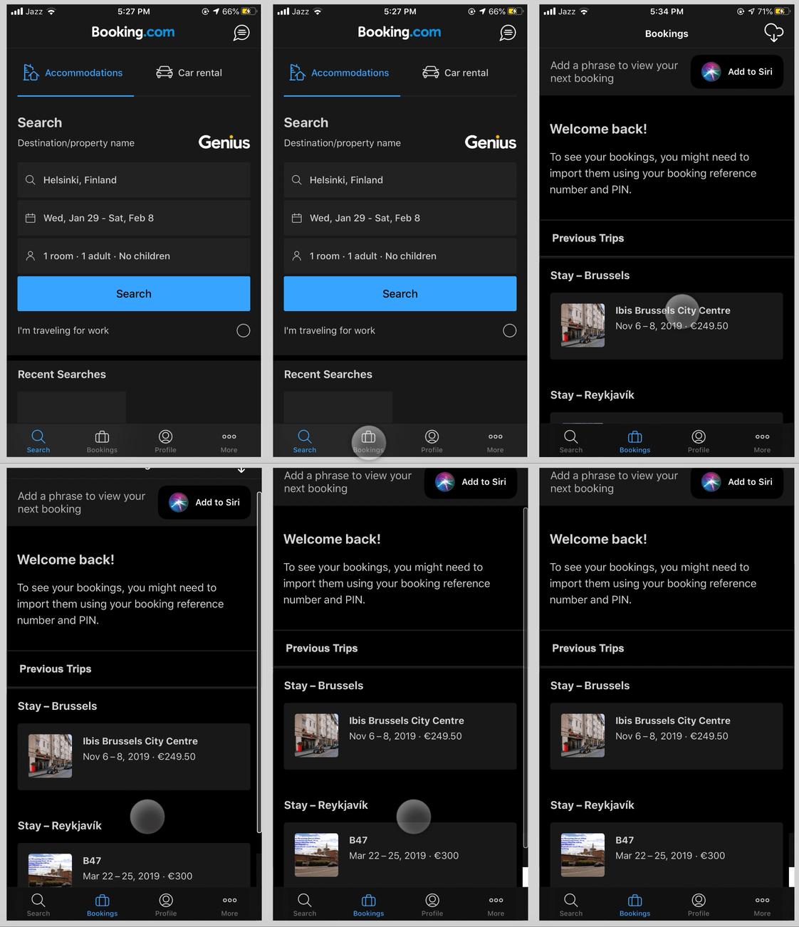
Macro-design: A dedicated page for bookings is directly accessible from the bottom navigation. To see any previous bookings/trips – the user must navigate further down
Micro-interaction: Click “All Previous Trips” to see all previous bookings
Issues: It’s an unnecessary step, causes navigational excise of one extra page.
Proposed changes:
– An alternative way to avoid this can be to include this information in the same page with clear distinction between future and past bookings to reduce the navigational excise.
Original design
Redesigned to reduce navigational excise
Original design
Redesigned with reviews carousel
7. Reading Reviews
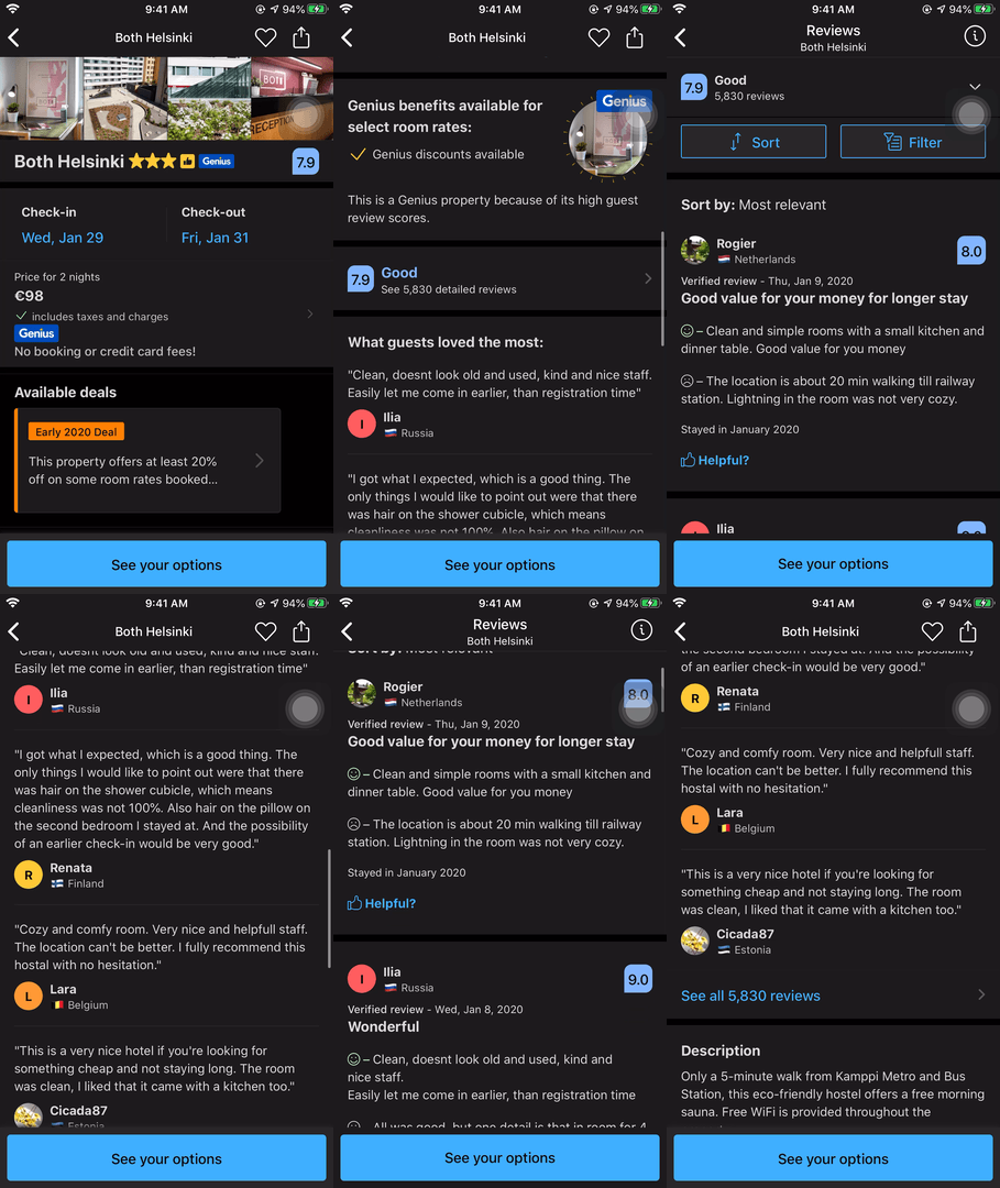
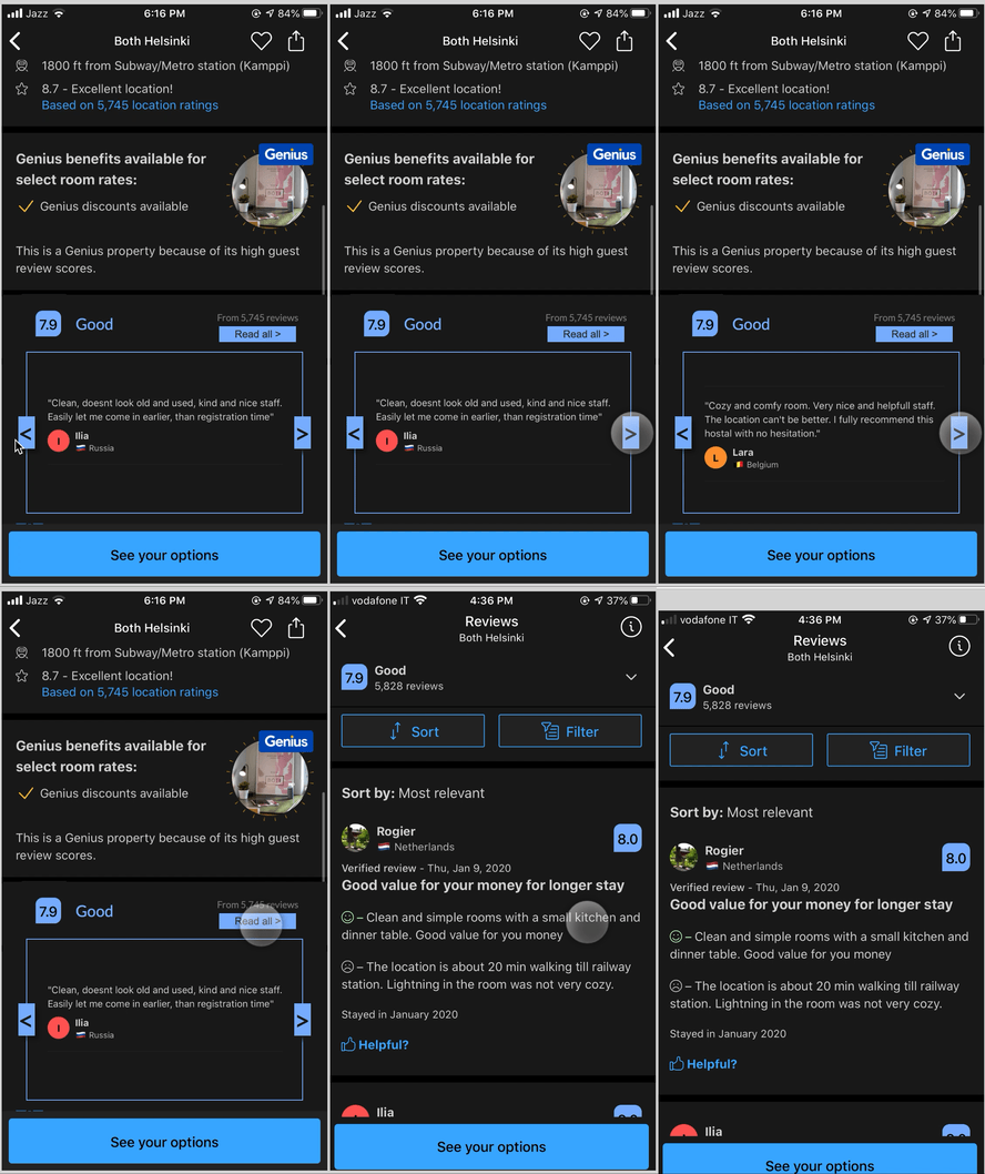
Macro-design decision: To put some reviews in full to see but also give the option of reading all the reviews for the user and so they can see the overall score.
Micro-interaction: Users see an average rating and then read some reviews or click to navigate to page to see all the reviews.
Issues: There’s multiple ways to navigate to the same place on the same page and the same information is repeated. (Knossos palace’s effect)
Proposed micro-design changes:
– Use space effectively by letting users go through reviews in a carousel fashion over there rather than repeat the same information again and again.
8. Profile Page – Edit
Macro-design decision: Let users edit their profile
Micro-interaction: Edit text button on in top bar (right)
Rules: Users need to edit profile information
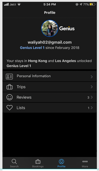
Issues: There are no signifiers here as to what exactly will be edited in what format as the profile page does not contain any standard profile details. Also even though “Edit” is indicating an action, it ends up being a navigational excise (due to the back arrow)
Proposed micro-design changes:
– Add personal information tab to signify that these can be edited later
– Add a view profile button where things can be individually edited
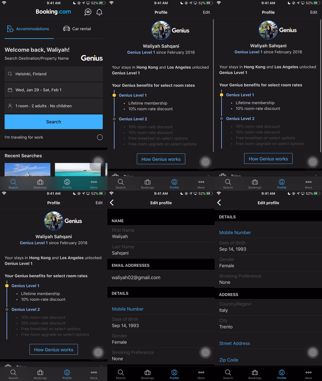
Orginal design
Redesigned with personalisation information tab
9. Profile Page – Edit Details
Macro-design decision: Let users edit their profile
Micro-interaction: Edit individual details by changing them in the form
Rules: Users must tap into each field to edit
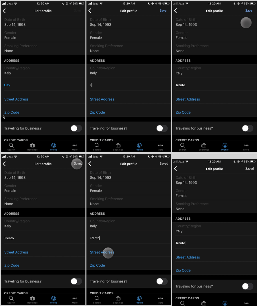
Issues: There is no feedback given about whether the details are being saved or not. There is also no feedforward as to what would be edited specifically.
Orginal design
Redesigned with feedback icon
Redesigned with Save button
Proposed micro-design changes:
– Add a tiny feedback icon to show what text field has been saved.
– Add a Save Text action button on top bar to allow user to save before leaving.
10. App Feedback
Macro-design decision: Ask users to give feedback on the app
Micro-interaction: Rate the app through icons
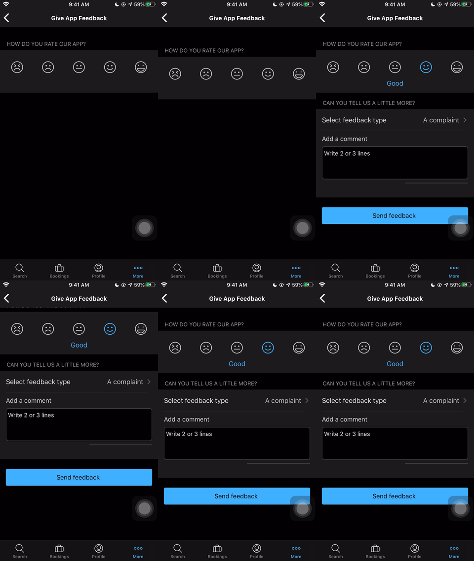
Issues: There is no signifier that there are additional questions beyond the first rating question.
Proposed micro-design changes:
-Show other questions or show one question at a time but add a signifier like “ 1 of 5”, and update as user answers – providing all feedback, feedforward and signifiers.
-Put entire feedback survey in step by step form – the UI takes you to the next question sequentially ( would be good to use concepts of loops
Original design
Redesigned with sequential feedback
Original design
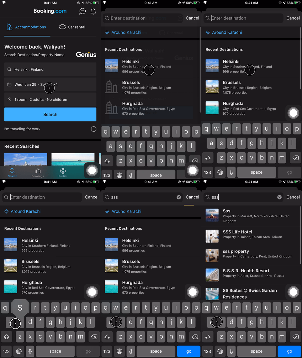
Redesigned with integrated search
11. Car Rental Search
Macro-design decision has been to put the “Car Rental” option at the same hierarchy as “Accommodation”
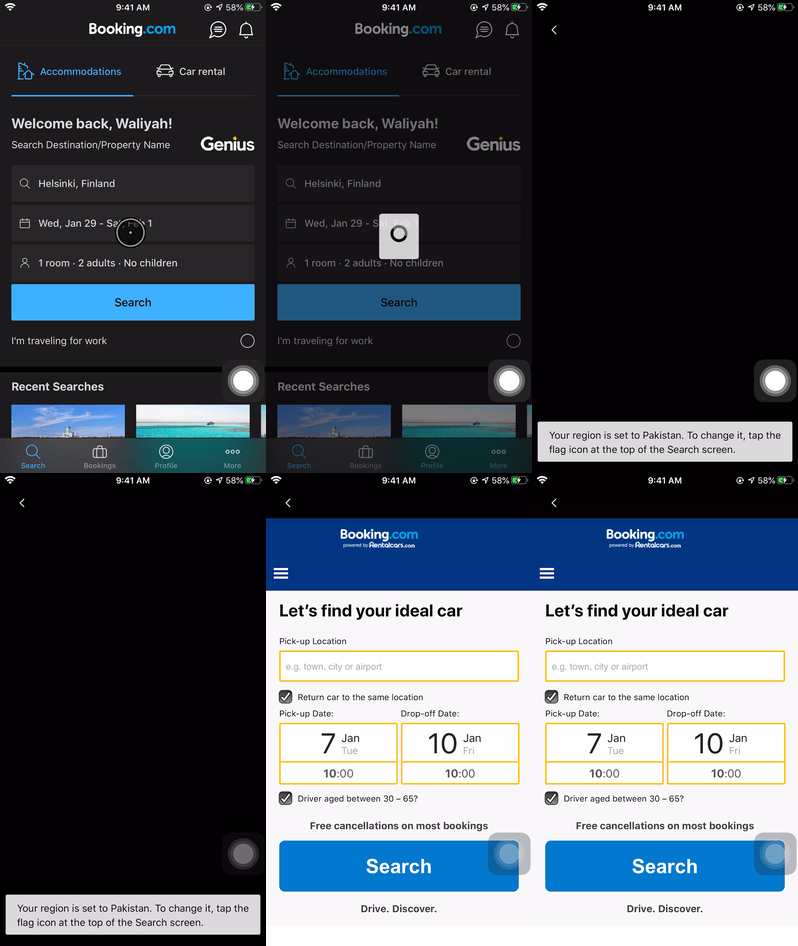
The car rental button takes you to an entirely different page – one that has not yet been built for the mobile app – the user is not expecting to see a different UI.
The user clicks/taps on “Car Rental”
Trigger: User wants to look at car rental services, clicks the button
Rules: User must know where and for how long they want to get a car
Proposed change:
– Instead of opening new page, customising the current UI to search for car rentals.
